Web Design Essentials for Better Results
Web Design Essentials
Web design essentials is something that demands a lot of thought process. Your website should be gorgeous to look at, should be easy to navigate, and at the same time, should be SEO-friendly so that search engines can give it some love in their search results. For that reason, when it comes to designing your website, consider putting a lot of intellect.
There are many aspects that you can consider to improve your website design and it’s responsiveness. Not everything, however, is going to work. Below is a guide that shows you some of the ways in which you can better your web design essentials.
Also Read: What is UI/UX Design: Crafting Engaging Digital Experiences with Concept Infoway
Go for Mobile-Friendly, Responsive Web Design
It is quite evident that most of the web traffic, coming to the websites these days, comes from mobile devices.
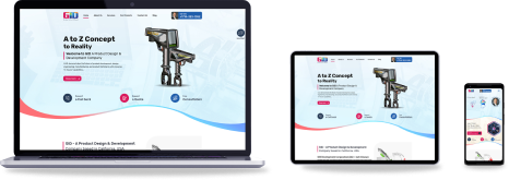
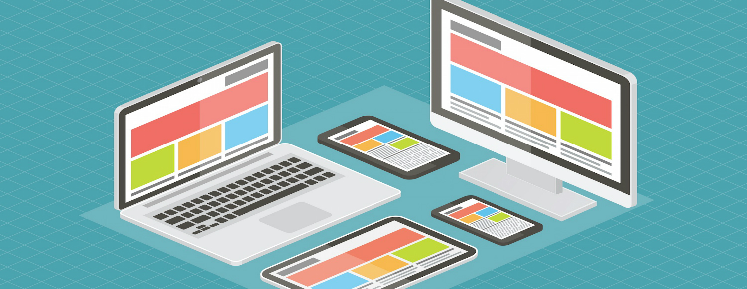
Mobile users are increasing, and the tendency of accessing the websites through mobile devices is still going to increase in the coming years. If your website is not mobile-ready, you are going to miss out massively. In order to avoid that, a mobile-friendly, responsive web design is the best solution. By the way, mobile-friendly, responsive web design means your website will seamlessly adapt to any device with any screen size and orientation.
Pick a Simple Web Design
Simple web designs with minimal elements seem to do the trick these days. A decade ago, web designs were massively complex. Today, everything has changed. Nowadays, the trend is for clean and flat web designs, which many popular brands are already adopting.
Impress your web visitors with a clean looking website rather than a flashy website. Besides, a flashy-looking web design only slows down the site.
Use Unique Photos
Stock photos are easily available, and they look great, yes. But, use them in moderation. Having unique images on your site can have a great impact. People, sometimes, tend to distinguish stock images quite easily. Try not to give them such an opportunity and instead, give them something unique that would make them go wow!
For the best results, try to blend both unique photos and stock photos.
Make the Navigation Simple
Potential customers who come to your site should be able to go to any page within a matter of seconds. The web visitors need to be able to find everything on your site with ease. Do not confuse them by giving too many options. For web pages with little importance, show their navigational links in the sub-menus.
Keep “Contact Us” Conspicuous
You want your potential customers to get in touch with you, so why make it difficult for them to contact you? Make sure your contact information is available on every page of your website; integrate a “Contact Us” form on the side of the page or in the footer. And, be sure that it is not a distraction, but attractive enough for people to use it. If you are making it tough for people to contact you, you are already losing a lot of leads.
Place the Social Media Feeds Carefully
Having social media feeds running on your site is beneficial, but be careful where you place those feeds. If you have the feeds in the wrong location, it can create distractions and distractions can be bad. Normally, social media feeds at the bottom of the home page, above the footer, would not create any problems.
Consider Every Web Page a Lead Capture Page
Concentrating on the home page is important, but it is equally important to focus on all the other web pages of your site. Consider every page of your site as a landing page or opportunity page and design it appropriately so to force people further down the sales pipeline. Just imagine the possibility of getting a sale from every page!
Clickable Logo
Be sure to make it easy for your web visitors to return to the home page of your site. Your business logo should be clickable, and it should take web visitors back to the home page. A clickable logo makes navigating back to home page easy, and many websites already have this feature, so it is something that is almost expected by the web visitors. Besides, it is quite an old convention, so people are expecting something to happen when clicking the logo.
Concentrate on ‘Above the Fold’
It is important to focus ‘above the fold.’ Many website owners complain that they are not getting enough user engagement on their site. What could be the problem? They keep all the necessary information below the fold. It is important to keep the necessary information above the fold so that when web visitors land on the page, they immediately see what matters.
Place the supplementary information below the fold.
Analyze Your Web Design Regularly
Web design trends keep on changing, and so do the needs of customers. It is essential to review your web design at least every six months to see what is latest and what web visitors are demanding. This regular analysis does not mean you need to consider a complete website redesign; rather, it means you should see whether you can make some small changes.
If you need effective web design solutions, you should partner with a reliable web design company, like Concept Infoway. Concept Infoway is one of the leading web design companies in India and provides exceptional web design solutions that are beautiful and effective. Using the latest web design techniques, our skilled web designers in India can help you create prolific websites that actually work for your business.
To learn more about our web design services, click here. Alternatively, you can also contact one of our representatives at sales@conceptinfoway.com.
Frequently Asked Questions – FAQs
What are the fundamentals of good web design?
The fundamentals of good web design include user-friendly navigation, responsive layouts, clear calls-to-action, fast loading times, and visually appealing aesthetics. Concept Infoway focuses on web design essentials by crafting websites that are not only beautiful but also strategically designed to engage users and drive results across all devices.
What are the basic concepts of web design?
Basic web design concepts include layout structure, typography, color theory, white space usage, and visual hierarchy. These principles ensure a seamless user experience. At Concept Infoway, we implement these web design essentials to build websites that are visually balanced, functionally effective, and conversion-oriented.
What are the fundamentals of web design?
Fundamentals of web design cover responsiveness, accessibility, content clarity, and intuitive user interface design. They form the foundation of any successful digital experience. Concept Infoway applies these web design essentials to every project, ensuring your site meets modern standards and appeals to your target audience.
What are the essential foundations of the web?
Essential web foundations include HTML for structure, CSS for styling, JavaScript for interactivity, and responsive frameworks for mobile support. Concept Infoway combines these technical web design essentials with top-tier UX practices to create dynamic, performance-driven websites that enhance user engagement.
What is the best program for web design?
Popular tools include Adobe XD, Figma, Sketch, and Webflow for design and prototyping. The best tool depends on project requirements. At Concept Infoway, we use industry-leading software to implement web design essentials, delivering modern, responsive, and highly functional websites tailored to your goals.
Which is best for web design?
The best approach combines great design tools with experienced designers who understand user behavior, branding, and digital trends. Concept Infoway is the best choice when you want a professional team that brings web design essentials to life—balancing creativity, usability, and performance in every project.
Does web design require coding?
Not all web design requires coding, but for custom and fully optimized websites, coding knowledge is important. Concept Infoway blends design expertise with development know-how, ensuring that every aspect of your site, from layout to backend, aligns with core web design essentials for seamless functionality.

Collaborate with Concept Infoway for Quality Web Development Services in India
